This dashboard provides a visual look at expenses in order of highest to lowest on the chart on the left.
The chart on the right displays expenses in order of difference from benchmark expenses as a percentage of sales. This chart can be updated by changing the value in the "% Difference" box from 1% to the desired value. For a fraction, such half, simply enter ".5" without the quotes.
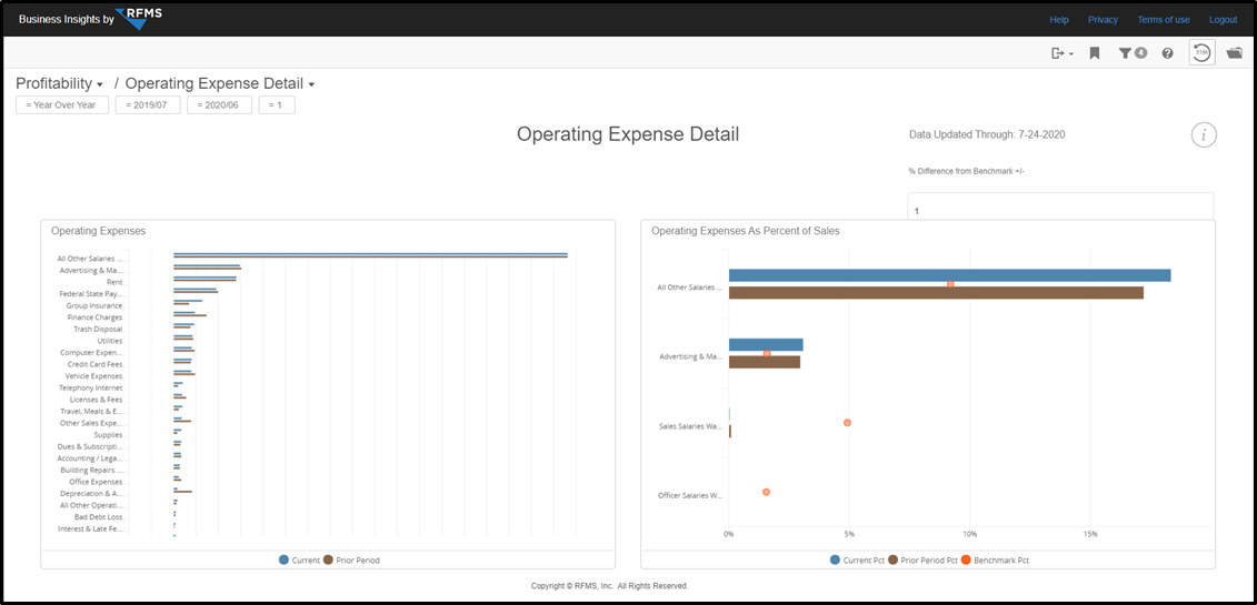
Charts
Operating Expenses: All operating expenses for the current period displayed in blue, previous period shown in brown.
Operating Expenses As Percent of Sales: Expenses filtered by the % Difference from Benchmark +/- value shown in the text box. 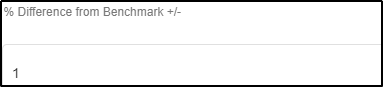
All expenses within the entered percent value of the benchmark will be displayed. Blue for current period, brown for previous and benchmark as the orange dot.
Comments
Please sign in to leave a comment.